
A single source of truth for the FRONTSTEPS product suite — tokens, components, and voice that let teams ship on-brand, accessible interfaces without reinventing the basics.

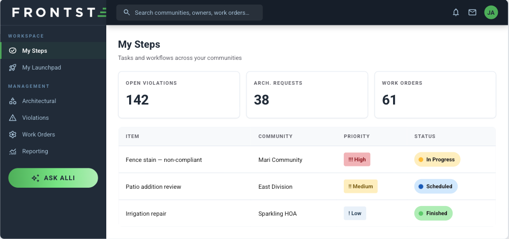
Suite Manager, built entirely from the system
A token-driven design system that turns FRONTSTEPS brand decisions into reusable, accessible, ready-to-ship UI — so teams build faster and every product looks like one product.

THE SYSTEM
One vocabulary across every product
FRONTSTEPS powers HOAs, community associations, and the management companies that run them. The design system codifies that world into a shared language — a deliberate two-color core of deep navy for trust and order and grass green for action and momentum, wrapped in a calm, operational voice built for people doing a job.
Everything traces back to tokens: color, type, spacing, radius, and elevation defined once and consumed everywhere. Product chrome, prototypes, slides, and marketing all pull from the same primitives, so a change at the token layer ripples through every surface consistently.
FOR DEVELOPEMENT
Built to expedite the build
The system isn't just a spec — it's shippable primitives that cut decisions, review cycles, and rework out of the pipeline.
Token-first, ship faster
Color, type, spacing, radius, and elevation ship as CSS variables. Pull the stylesheet, reference the tokens, and every screen inherits the brand — no hex-picking, no guesswork.
Accessible by default
Contrast-checked palettes, always-visible focus rings, and Material Symbols baked into the primitives mean a11y is inherited, not bolted on late.
Reusable Components
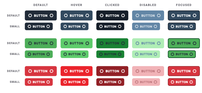
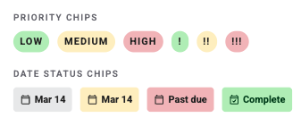
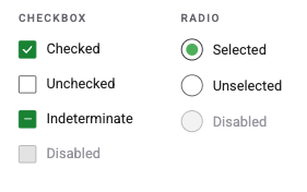
Buttons, chips, controls, and navigation come pre-styled with every state — hover, active, disabled, focus. Drop them in and skip rebuilding the same patterns per feature.
One system, every surface
Suite Manager, ALLi, and sibling products like Caliber all draw from one vocabulary — so a new product surface starts 80% designed on day one.
Design–dev parity
Color, type, spacing, radius, and elevation ship as CSS variables. Pull the stylesheet, reference the tokens, and every screen inherits the brand — no hex-picking, no guesswork.
Consistency that scales
Update a token once and it propagates everywhere. The system enforces brand consistency across teams without a design review on every pixel.

FOUNDATIONS
color
Two brand colors do the heavy lifting; backgrounds stay light and flat. Gradients appear in exactly one place — the ALLi assistant pill — and nowhere else.
NAVY - TRUST, ORDER, CHROME
#ECF3FA
#A9C2D6
GREEN - ACTION, SUCCESS, MOMENTUM
#E6FFE6
#38536B
#BAF0BA
ALERTS - ACCESSIBLE, ON-PALETTE
INFO / LINK
#D6EBFF
#0067C5
#BAF0BA
#87E987
SUCCESS
#238E30
#243141
#5CB85B
WARNING
#FFF0C2
#FFC107
#15212F
#238E30
ERROR
#F3BABF
#DC3545

FOUNDATIONS
TYPOGRAPHY
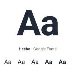
One family, Heebo, from 300 to 700. The brand's signature tic: uppercase with wide tracking on navigation and buttons.



BUILDING BLOCKS
COMPONENTS
A consistent, accessible set — flat surfaces, restrained radii, borders over shadow, and always-visible focus.